Data Visualization on a 4" Screen
To walk through San Francisco is to interrogate the lurid, sometimes brutal history of California’s settlement in the mid-nineteenth century. Each street has a story. Guerrero Street is named for Francisco Guerrero, a landowner and politician killed by a slingshot-wielding horseback assassin in 1851. Charles H. Gough, a local milkman, served on the committee that named many of the streets in 1855; in a bit of minor civic corruption, he named a major thoroughfare after himself and other streets after his sister, Octavia, and a friend, Steiner.
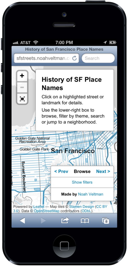
Noah Veltman, a San Francisco-based coder and designer, wanted to create an application to exhume this history. He envisioned a scrollable, zoomable map to surface the stories behind each street name. And because each tale is so intimately tied to geography, he wanted explorers to be able to access his map on-the-go. These days, says Veltman, “designing anything of substance involves thinking about mobile” — which means grappling with new constraints and problems.
Modern newsrooms have the same challenge, caught as they are between two powerful trends: the exploding volume of digital information, and the rapid shift to mobile computing.
Veltman had to figure out how to ensure even fat fingers could “click” tiny streets
The storage company EMC estimates that we created 2,800 exabytes of data in 2012 (to put that in perspective, one exabyte is roughly equivalent to a billion gigabytes, and can store 36,000 years worth of HD video). Ben Fry, the designer behind the Processing language, likes to say that visualization is one of the best ways to cope with this data overload because “our eyes are the highest bandwidth channel for getting information into our brains.”
And in the context of news, more and more eyeballs are directed at mobile devices. Nearly half of American adults own a smartphone and 31% have a tablet, according to Pew Research Center. More than a third of those people check the news daily on their devices; NPR reported that fully half its traffic on election night last year came from mobile users. This shift in reader behavior is mirrored by a shift in business imperatives, with mobile ad revenues up 80 percent in 2012, to $2.6 billion, while the overall digital ad market grew 17 percent, according to Pew.
Veltman is currently working at the BBC as a Knight-Mozilla Fellow, a program that embeds hackers in newsrooms around the world. He found that creating clickable streets on a dense map interface was a major challenge. “It was already borderline unreasonable to expect people to successfully click on them with a mouse,” he says. “It was impossible to expect it with a fingertip.”
His solution?
What I ended up doing is listening for mouse clicks anywhere on the map that isn’t clickable, and then doing a bunch of math to figure out the closest clickable point, and then, if the distance to that point was less than a certain threshold, highlight that object. So basically it estimates in a very convoluted way what street you meant to click.
Didn’t quite get that? Don’t worry. Veltman, who’s been designing websites since the Geocities era and is a veteran of several startups, is in the 1% of newsroom programmers. And when it comes to visualizations for mobile devices, most organizations still need to grapple with the basics.
“I think most news organizations are getting ahead of themselves when it comes to mobile dataviz,” says David Yanofsky, a designer and coder in the Quartz newsroom. While the digital cognoscenti fawn over complex, cutting-edge projects, “there still isn’t a good archetype” for the simple stuff, he says. “I have yet to see a well-designed interactive line chart made for mobile. Once the simple stuff gets figured out, the more complex stuff will have a better foundation to build off of.”
Amanda Cox, a vaunted interactive designer at The New York Times, says designing for multiple screens — even when the designs are simple — is an enormous challenge. “Simple adapting tends to lead to stuff that’s mediocre in at least one space,” she says. “Good designs exploit what’s unique about the environment they live in.” Interactive newsrooms need to update their style manuals, and decide on rules for when and where mobile-specific actions, like sliding and shaking, are appropriate, and templates that ensure that desktop buttons and links don’t shrink to unclickable specks on mobile screens.
Mobile designers must also become as integral a part of the newsroom process as desktop designers have become, helping editors and reporters figure out the best — and most realistic — treatment for their stories. At the same time, they must acknowledge that not every news story lends itself to an infographic, and not every inforgraphic will work on a smaller screen. Quartz tries to make every graphic mobile-friendly, but “sometimes we decide that the specific thing we’re making is inherently not mobile-friendly,” says Yanofsky. Mobile devices are, after all, still more limited in terms of processing power. And while they’ll get faster, there will always be a new form factor (Google Glass, anyone?) that introduces new limitations.
Once they figure out the basics, newsrooms can start looking for clever ways around those limitations, just as Veltman did when he came up with an algorithmic way to guess a user’s intention. Still, the emphasis must remain on the story and the information, not on programming tricks.
“Designers need to embrace their lack of control in a device-diverse world,” says Veltman. “Yes, painting when you don’t know the size of the canvas is hard, but when you worry less about the paint and more about what the painting is trying to say, it starts to make sense.”
Note: This piece appeared in slightly different form at Columbia Journalism Review.
